
Designing for three screens without building three products
Dense financial data on desktop, tablet and mobile isn't a scaling problem. It's a prioritisation problem.
by Polina Nikolova · Jun 18, 2024

When a data-heavy product moves to smaller screens, the usual instinct is to shrink. Columns collapse, charts compress, controls hide behind menus — and the experience becomes technically responsive but practically unusable.
The better framing is that each form factor serves a different intent. Desktop is for analysis. Tablet is for review. Mobile is for checking and acting. Once the intent is clear, the layout follows.

Define the primary job per device
Ask what a user most often needs in each context. On mobile it might be a single number and one action. Designing for that job first prevents the interface from becoming a miniature of the desktop.
Decide what disappears
Responsive design is largely a series of removal decisions. Anything that does not serve the device's primary job should be reachable, not present. Making those calls explicitly beats letting a grid system make them by accident.
Keep one information model
Three layouts, one underlying structure. When the labels, hierarchy and terminology stay consistent, users can move between devices without relearning the product — even though the screens look different.
Test with real data
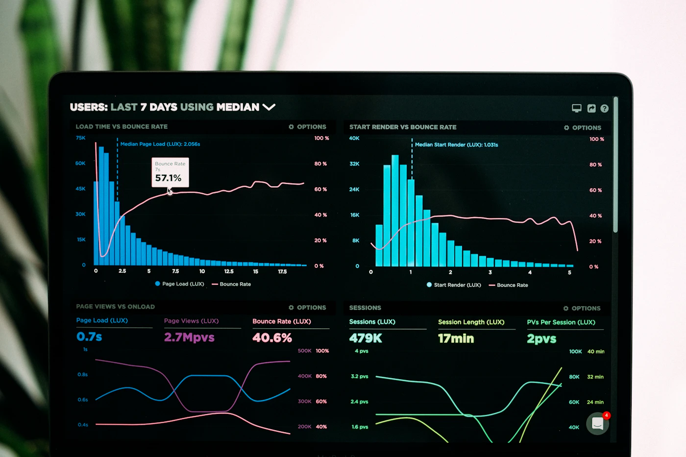
Placeholder values hide the problem. Long instrument names, negative figures, multiple currencies and dense time series are where layouts break. Design against the worst realistic case, not the tidy one.
Three screens, one product. The discipline is in choosing, not shrinking.
Key takeaways
- Desktop analyses, tablet reviews, mobile checks and acts.
- Responsive design is mostly a series of removal decisions.
- Keep one information model across all three layouts.
- Test with worst-case real data, never placeholders.