
Fintech • Usability Testing • UX Research • Information Architecture
Turning usability evidence into a clearer fintech learning experience
A fintech investment platform needed to understand whether its Knowledge Centre truly helped people learn, orient themselves, and choose relevant content. We tested five realistic journeys with six users and converted observed behaviour into a focused improvement direction.
- ✓Tested five core learning journeys with six representative users
- ✓Measured task success and confusion at each stage
- ✓Identified navigation, terminology, and personalisation friction
- ✓Prioritised product changes using observed behaviour
Fintech investment education and self-directed learning
Validate whether users could find, understand, and continue relevant learning content
Test planning · Facilitation · Behaviour analysis · Recommendations
An evidence-led product direction grounded in five measured journeys
Outcome first
Business Outcomes
The study replaced internal assumptions with behavioural evidence, showing where the experience supported confidence and where it made prospective investors work too hard.
Made learning friction measurable
Success and confusion were assessed task by task, revealing that findability deteriorated in deeper content journeys.
Protected investment in the right changes
Observed behaviour separated structural navigation issues from copy, labelling, and personalisation problems.
Preserved what users already valued
The study confirmed strong response to the video format, subject coverage, tags, and overall Knowledge Centre design.
Created a clear optimisation backlog
Recommendations connected each issue to evidence, severity, and a specific improvement opportunity.
The business problem
The Challenge
The Knowledge Centre combined educational videos, topic navigation, tags, an investor quiz, and personalised recommendations. It looked comprehensive, but the business needed to know whether people with different levels of investment experience could confidently use it.
The risk was not simply that users might miss a video. Misleading navigation or an unconvincing investor profile could weaken trust at the point the platform was trying to build financial confidence.
The study therefore had to evaluate both usability and proposition clarity: could users find content, understand what would happen next, and believe that the experience was relevant to them?
"A learning platform creates value only when users can find the right knowledge and trust the path that leads them there."
Participants ranged from below-average to above-average investing knowledge.
Sidebar, arrows, tags, overview links, and the main site navigation implied different paths.
The quiz promised relevance, but its questions and trader profile reduced confidence for several users.
Confusing labels and unexpected destinations could undermine the educational value of the platform.
Framing
Discovery & Product Definition
We recruited six users with varied investment knowledge and intent, then observed them completing five scenarios from general orientation to personalised learning and deeper topic navigation.
The content itself was not the main weakness. Users liked the video format, topics, tags, and visual design.
Confidence broke when controls did not match expectations — particularly the recommendation call-to-action, the trader-profile result, and arrows that moved across the content hierarchy unpredictably.
The opportunity was to simplify the route to useful content, not to rebuild the Knowledge Centre from scratch.
Representative Scenarios
Five tasks covered open exploration, tailored recommendations, share education, returning to content, and moving between product topics.
Behavioural Observation
Sessions captured click paths, hesitation, wrong turns, expectations, and spontaneous reactions — not only completion.
Task-Level Measurement
Success and confusion rates exposed a clear performance gap between introductory and deeper navigation tasks.
Qualitative Synthesis
Recurring comments were grouped into navigation, terminology, findability, relevance, and trust themes.
Product strategy
Key Product Decisions
The recommendations focused on the smallest structural changes capable of improving findability and confidence while preserving the parts users already valued.
Make one navigation model authoritative
The left sidebar was consistently understood, while page arrows often produced an unexpected topic. Secondary navigation should follow the same hierarchy.
- ✓More predictable movement between lessons
- ✓Fewer dead ends in deeper journeys
- ✓Stronger continuity across topics
Replace the quiz-first route to relevance
Users initially welcomed personalisation but became sceptical when advanced questions produced an unconvincing trader profile.
- ✓Faster access to suitable content
- ✓Lower cognitive load for beginners
- ✓Less risk of overclaiming personalisation
Use direct, expectation-setting labels
Labels such as ‘Recommend resources for me’, ‘Overview’, and ‘Buy a product’ did not accurately describe the destination or felt commercially premature.
- ✓Clearer next-step expectations
- ✓More appropriate educational tone
- ✓Higher confidence before clicking
Turn tags into reliable orientation tools
Tags were one of the clearest content signals, but users expected them to lead to complete, relevant topic views.
- ✓Improved cross-topic discovery
- ✓Stronger information scent
- ✓Less dependence on users remembering the sidebar
Research design
Building the Evidence
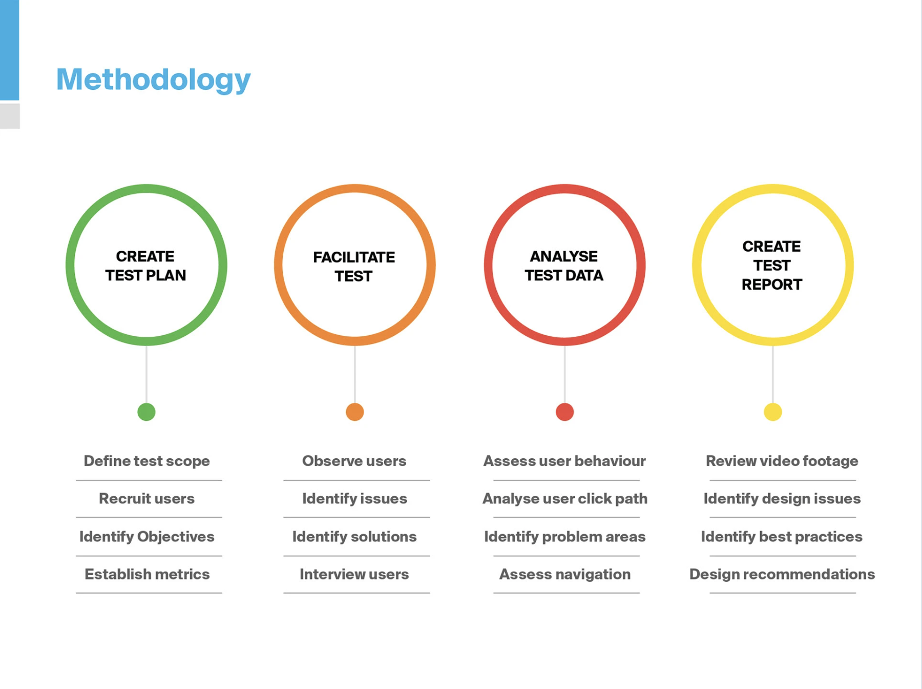
A structured four-phase study connected business questions to realistic tasks, direct observation, measurable results, and prioritised recommendations.
Create Test Plan
Recruit Participants
Facilitate Tests
Analyse Behaviour
Report Priorities
A repeatable path from research question to actionable product recommendation.
From observation to evidence
Exploring the Experience
Five realistic learning journeys created a natural progression from first impressions to deeper content discovery. We observed what users did, measured where confidence dropped, and connected each pattern to a product decision.
- 01Frame the questions
- 02Test realistic journeys
- 03Observe behaviour
- 04Compare the evidence
- 05Prioritise change
A strong first impression
Users responded positively to the video format, subject coverage, tags, and visual design.
Confidence dropped with depth
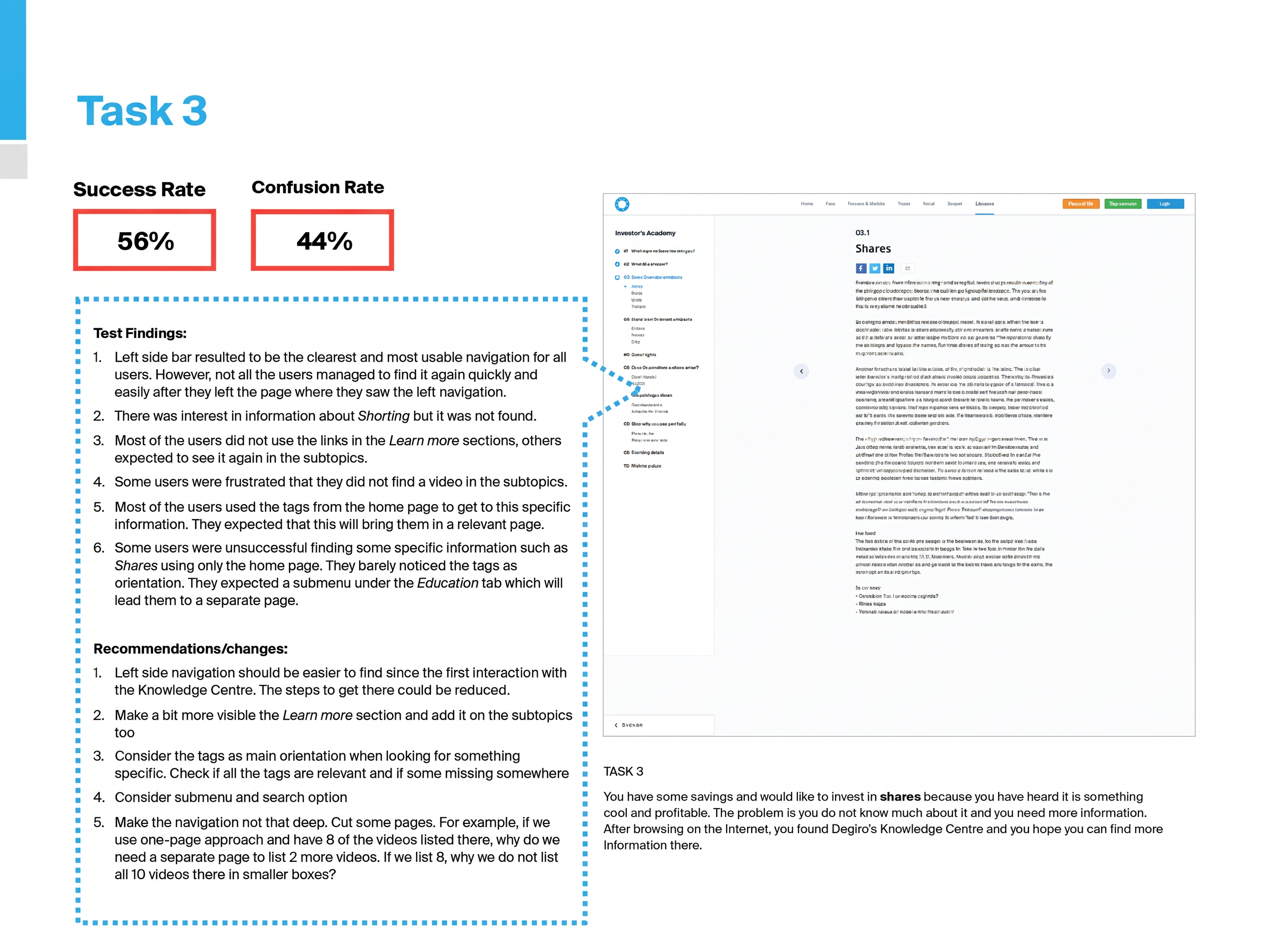
Success fell to 56% when users had to locate detailed information within the content hierarchy.
Navigation broke expectations
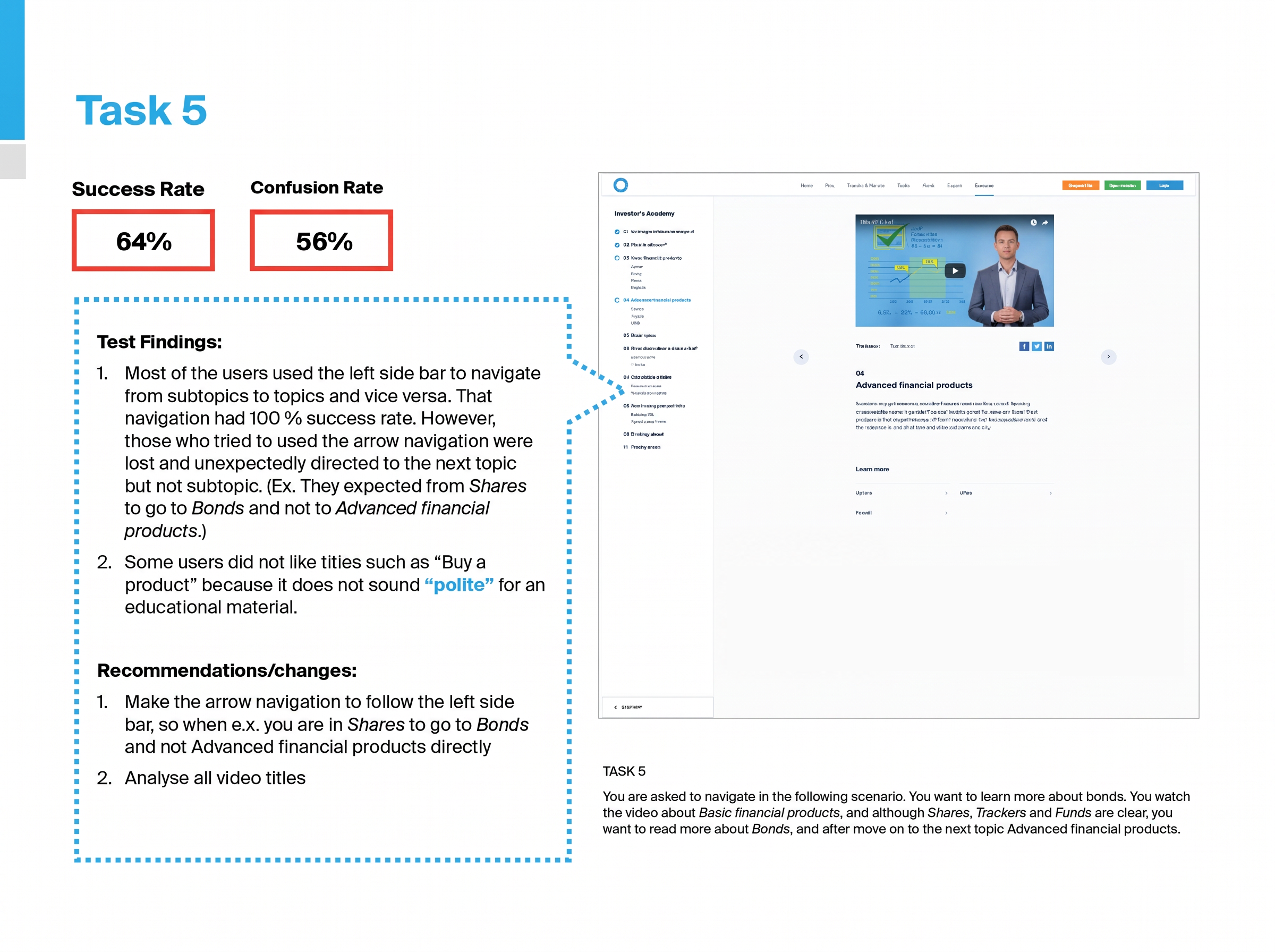
Confusion peaked at 56% when arrows did not follow the sequence established by the sidebar.
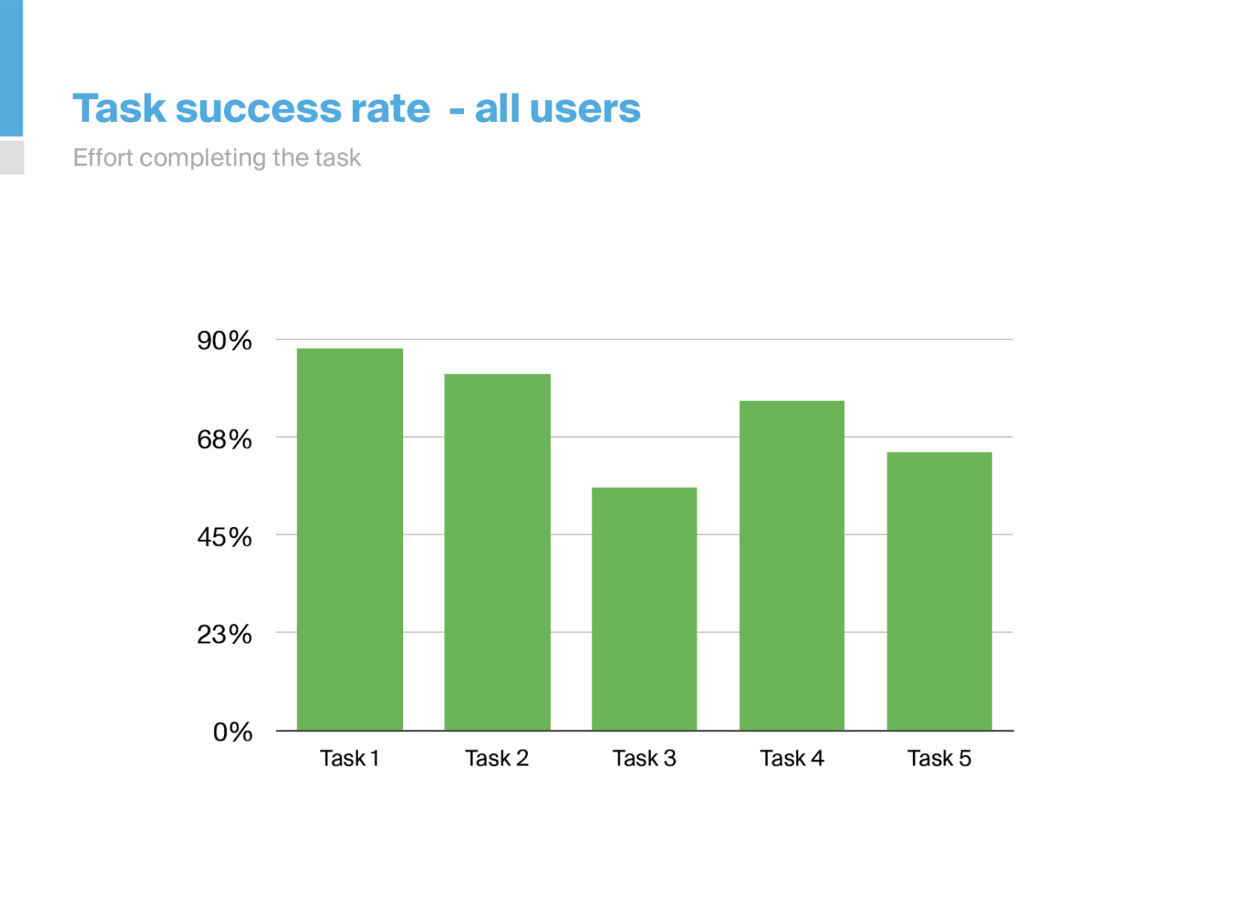
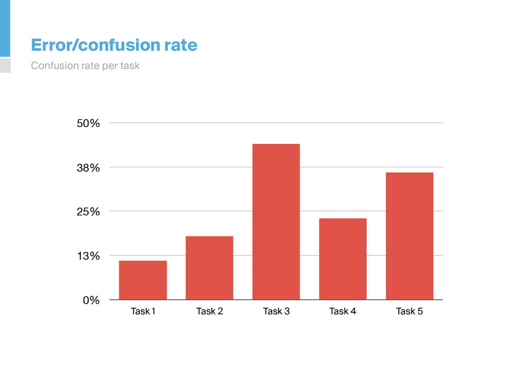
The evidence converged on one clear opportunity: preserve the content users valued while making deeper journeys predictable, findable, and easier to trust.
Evidence to action
Research Findings & Recommendations
The final report connected each priority to measured performance, observed behaviour, user language, and a concrete product recommendation.
Reframe tailored learning
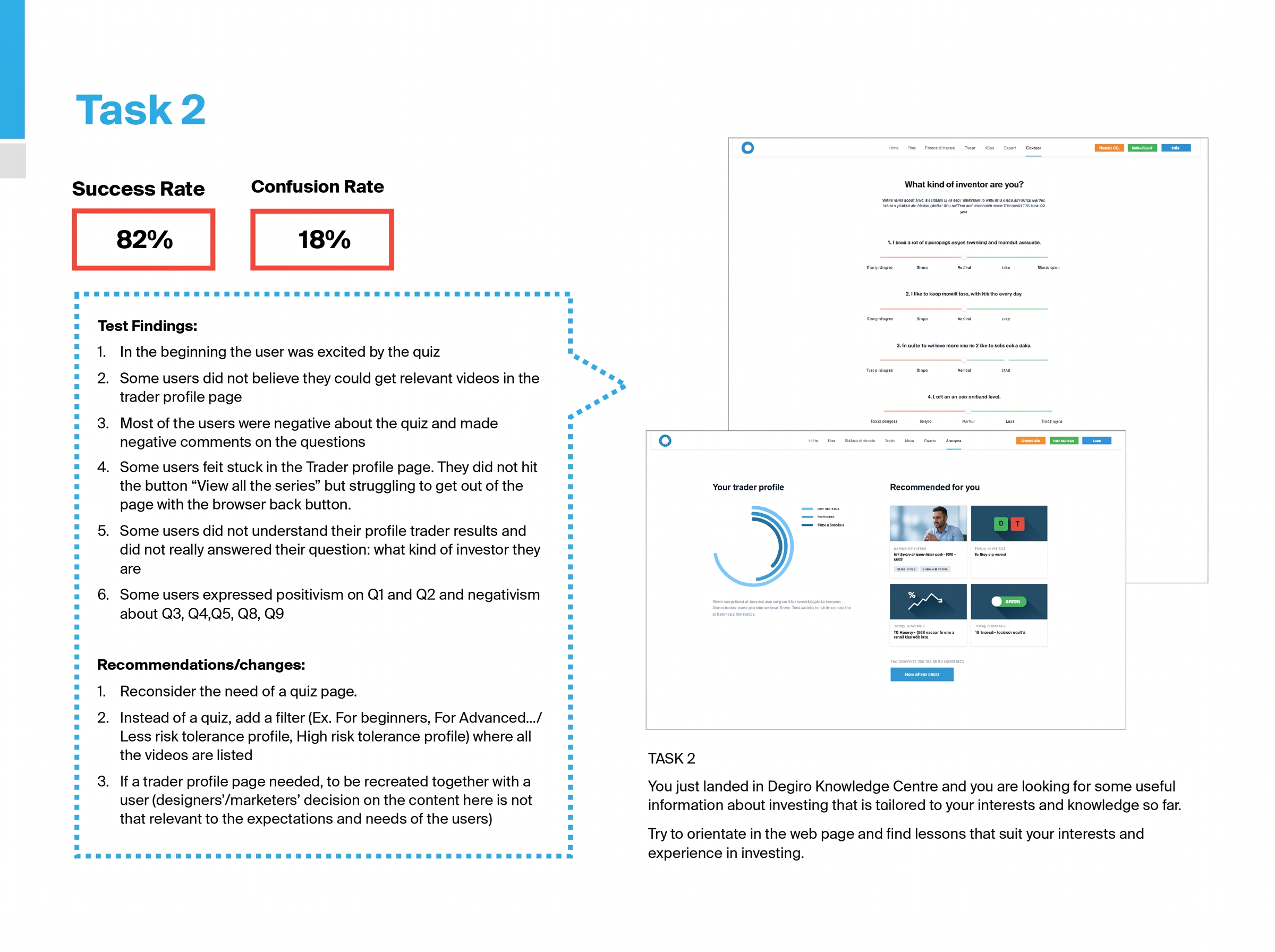
Task 2 achieved 82% success, but the quiz and trader profile divided opinion. A direct filter by experience, interest, or risk would provide relevance without asking beginners to trust an opaque classification.
- ✓Keep the initial interest in tailored content
- ✓Replace advanced quiz questions with understandable filters
- ✓Validate any future profile concept with users
Strengthen topic findability
Task 3 produced the lowest success rate at 56% and 44% confusion. Users relied on the sidebar and tags, but struggled after leaving the main path or when expected subtopic content was absent.
- ✓Make the sidebar easier to recover
- ✓Add an Education submenu and stronger topic paths
- ✓Use tags and ‘Learn more’ links consistently
Align sequential navigation
Task 5 generated the highest confusion rate at 56%. Users expected arrows to move from Shares to Bonds, following the visible sidebar order, but reached a different content level.
- ✓Make arrows follow the sidebar hierarchy
- ✓Review titles for clarity and educational tone
- ✓Replace commercially heavy labels such as ‘Buy a product’
Role & ownership
Our Contribution
End-to-end product leadership — from discovery and strategy through workflow definition and delivery support.
Business outcomes
What Changed
The engagement turned a broad usability question into a focused product agenda: preserve the educational strengths, make navigation predictable, and offer relevance without weakening user trust.
Lessons & principles
Strategic Takeaways
Success alone hides hesitation
A completed task can still contain uncertainty. Measuring confusion alongside success revealed where the experience felt fragile.
Navigation is a promise
Arrows, labels, tags, and sidebars must describe the same content model or users cannot predict where an action will lead.
Personalisation must earn trust
A quiz adds value only when users understand the questions, believe the result, and can see how it improves their experience.
Preserve validated strengths
Good research does not justify a redesign by default. It shows what to keep as clearly as what to change.
Uncertain where users lose confidence?
Analytics show where people stop. Structured usability testing reveals the expectations, decisions, and moments of confusion behind the numbers.
We help fintech and SaaS teams turn observed behaviour into focused product priorities — before committing to a broad redesign.
No long-term commitments. No generic frameworks. Just clear direction.