
Investment Platform • Responsive UX • Financial Data • Product Design
Turning dense financial data into a purpose-built experience for every screen
An investment platform needed to integrate a richer financial-data experience without forcing one desktop interface onto every device. The work translated the same market intelligence into three deliberate experiences — each designed around the decisions users make in that form factor.
- ✓Integrated complex market and company data into one coherent product view
- ✓Designed distinct desktop, tablet, and mobile information hierarchies
- ✓Protected critical trading actions across every form factor
- ✓Validated responsive decisions with front-end and back-end teams
Digital investment and trading platform
Make dense financial intelligence useful across desktop, tablet, and mobile
Financial data analysis · Responsive UX · UI design · Technical validation
A scalable, device-aware product system for market analysis and action
Outcome first
Business Outcomes
The project created a clearer path from market information to investment action while giving the product team a responsive foundation that could support future data modules.
Made financial intelligence easier to act on
Price movement, company context, financials, analyst views, and order data were organised around the decisions investors needed to make.
Extended the product beyond desktop
Mobile and tablet became intentional working experiences rather than reduced copies of the full dashboard.
Protected critical actions
Buy, sell, price, position, and market-status information remained prominent as layouts and interaction patterns changed.
Reduced delivery ambiguity
Design decisions were reviewed with front-end and back-end developers, connecting interface ambition with technical feasibility.
The business problem
The Challenge
The product combined live pricing, charts, news, company information, financial statements, ratios, analyst sentiment, events, and order-book data. On desktop, users could scan these signals in parallel. On smaller screens, the same density would become unreadable and force critical actions below secondary content.
The challenge was therefore not conventional responsive resizing. Each form factor required its own hierarchy: desktop for broad comparison, tablet for focused analysis, and mobile for fast monitoring and action.
At the same time, all three experiences had to preserve one product language, consistent data meaning, and implementation logic that engineering teams could support.
"Responsive financial design is not about fitting the same dashboard into less space. It is about preserving the right decision at every scale."
Multiple financial modules competed for attention on a single product page.
Desktop supported research while mobile needed rapid monitoring and action.
Price, position, buy, and sell actions could never disappear inside responsive reflow.
New modules had to align with available financial data and existing platform behaviour.
Framing
Discovery & Product Definition
The work began by mapping the available data, the investment decisions it supported, and the relative importance of every module across device contexts.
Users did not need identical screens. They needed consistent meaning and uninterrupted access to the next relevant decision.
Desktop rewarded breadth and comparison. Tablet required a tighter analytical workspace. Mobile demanded progressive disclosure, clear section boundaries, and persistent access to market status and trading actions.
Financial Data Analysis
Mapped pricing, range, company fundamentals, financials, ratios, analyst sentiment, news, events, and order-book information.
Decision Hierarchy
Separated always-visible market signals from supporting information users could reach progressively.
Form-Factor Context
Defined the different scanning, comparison, and action needs associated with desktop, tablet, and mobile use.
Technical Validation
Reviewed proposed modules and responsive behaviours with front-end and back-end developers before finalisation.
Product strategy
Key Product Decisions
The design system kept the financial model consistent while allowing composition and interaction to change meaningfully by device.
Design around decisions, not breakpoints
A smaller viewport changes how investors scan, compare, and act. Layouts were rebuilt around those behaviours rather than mechanically collapsed.
- ✓Clearer hierarchy on every device
- ✓Less cognitive load on mobile
- ✓Faster access to relevant actions
Keep market context and action connected
Price, movement, position, and trading actions form one decision unit and needed to remain visually connected across all layouts.
- ✓Reduced context switching
- ✓Stronger decision confidence
- ✓Consistent transactional logic
Use progressive disclosure on mobile
Supporting information was reorganised into a clear vertical sequence rather than compressed into unreadable multi-column panels.
- ✓Readable financial details
- ✓Predictable scrolling
- ✓Preserved analytical depth
Make desktop serve comparison
The wide canvas was used to place related modules together so users could compare market movement, fundamentals, news, and sentiment without losing context.
- ✓Faster cross-reference
- ✓More efficient research
- ✓Better use of screen real estate
Responsive product architecture
Designing for Three Modes of Use
One underlying financial model was translated into three presentation strategies, with hierarchy and interaction tailored to the strengths of each form factor.
Map Data Priority
Define Core Actions
Compose Desktop
Adapt for Tablet
Sequence for Mobile
Consistent information and actions, deliberately recomposed for each context.
From one system to three experiences
Exploring the Responsive Experience
The exploration tested how the same financial story could remain coherent while moving from parallel desktop analysis to focused tablet review and sequential mobile use.
- 01Inventory the data
- 02Rank decision value
- 03Group related signals
- 04Adapt interaction
- 05Validate feasibility
Desktop: compare
Use the wide canvas to expose relationships between market, company, and analyst data.
Tablet: focus
Retain analytical context while reducing peripheral modules and strengthening the primary workspace.
Mobile: sequence
Turn dense panels into a readable journey without hiding price, status, or essential actions.
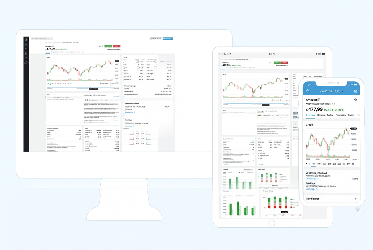
The result was one coherent product expressed through three purpose-built information architectures.
Role & ownership
Our Contribution
End-to-end product leadership — from discovery and strategy through workflow definition and delivery support.
Business outcomes
What Changed
The engagement turned responsive design from a resizing task into a product architecture decision — preserving analytical depth while making every screen appropriate to how and where it would be used.
Lessons & principles
Strategic Takeaways
Responsive means contextual
The strongest multi-device products adapt hierarchy and behaviour, not only dimensions.
Data needs editorial judgement
Financial completeness creates value only when information priority helps users decide what matters now.
Consistency is deeper than layout
Screens can differ substantially while preserving the same terminology, data meaning, and action model.
Feasibility belongs in design
Early collaboration with engineering turns responsive concepts into a scalable implementation direction.
Does your product need to work harder across devices?
Responsive complexity is often an information and product-strategy problem before it becomes a layout problem.
We help fintech and SaaS teams turn dense products into coherent experiences designed for the realities of desktop, tablet, and mobile use.
No long-term commitments. No generic frameworks. Just clear direction.